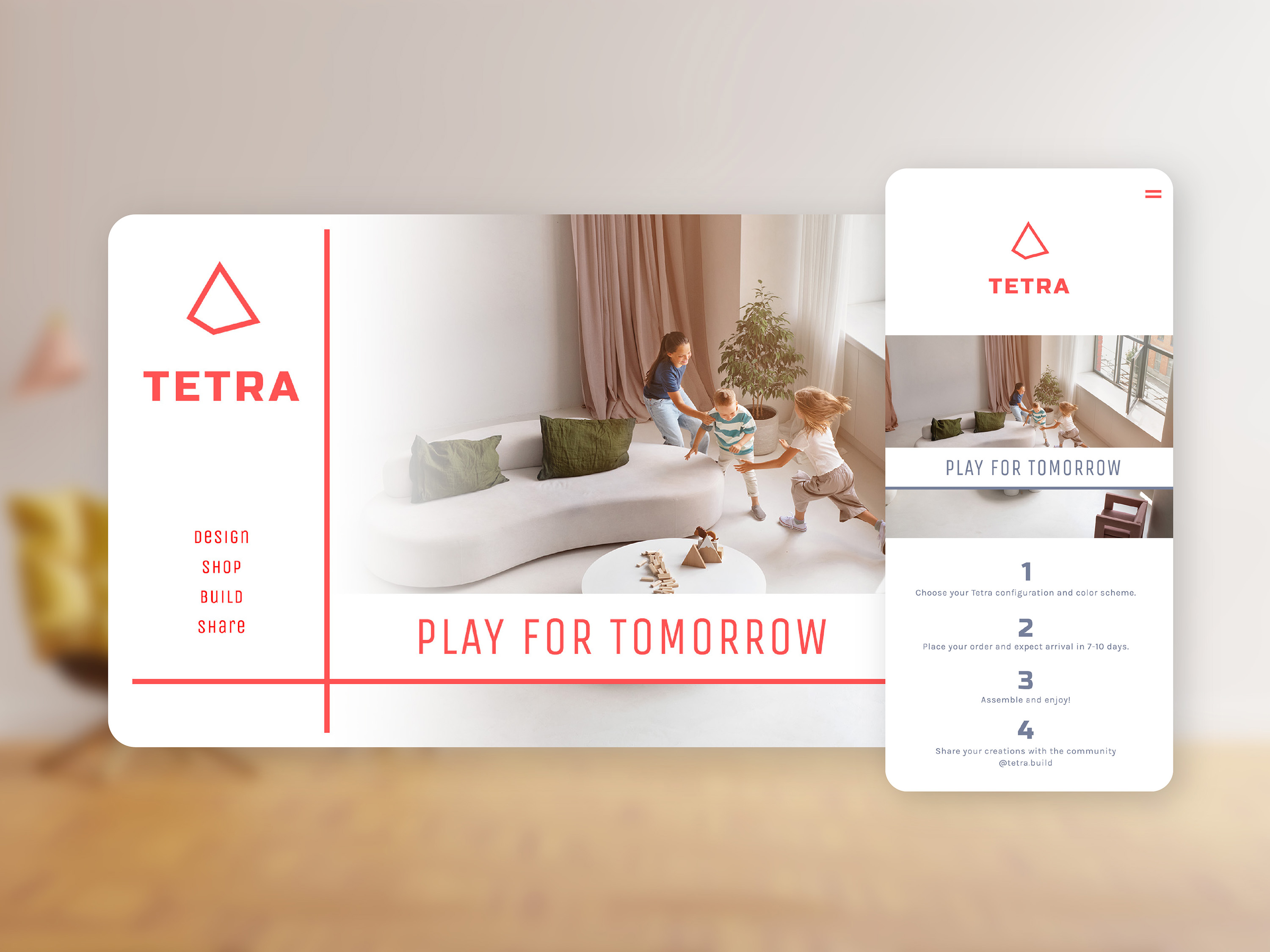
Brand identity and product design for Tetra
I began with pencil on paper for the logo, then began iterating in Illustrator. The product is an interactive pyramid-shaped toy, so naturally, I began playing with triangles and pyramids of various levels of detail. Initially, I felt a big, chunky typeface would best represent the stable nature of the toy and be reminiscent of building blocks, but the lighter-weight fonts were well suited also. An intense red jumped out early on as the perfect color for Tetra, and I carried it through the web design in a brutalist style. And since it was such an early design stage, I still explored an alternate path for the web design with a broader color palette and subtle blend of product feature and imagery, eventually settling on a dark coral as the primary color.